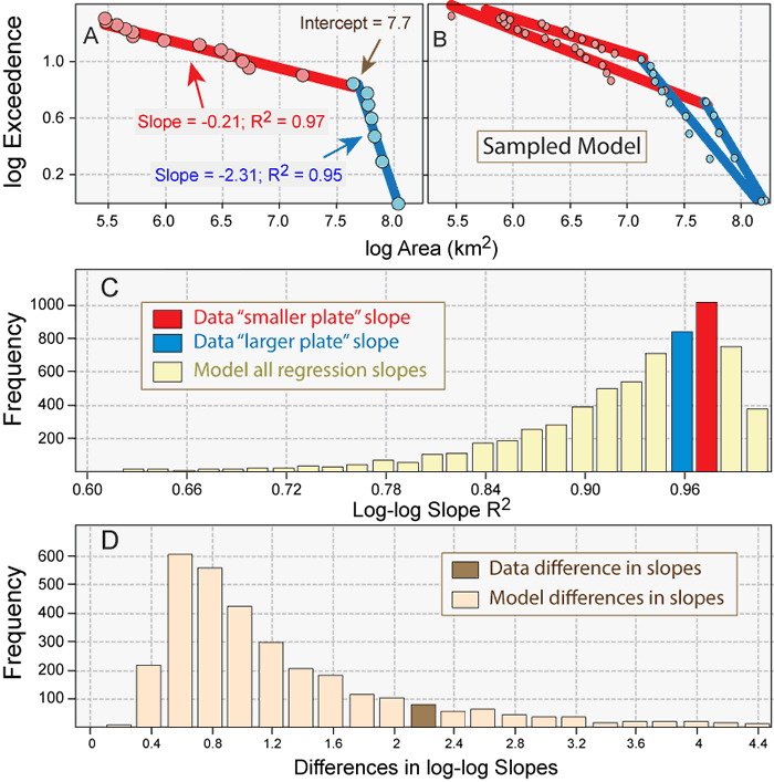
Figure 2.
Correlations and slopes of apparent linear trends in measured and model plate area frequencies. (A) Plate areas from Gurnis et al. (2012) exhibiting an apparent inflection in slope at log area ~7.7 (~50 × 106 km2); slope difference is 2.11. (B) Two model area frequency distributions, each comprising 20 randomly delimited plate areas with a total of 510 × 106 km2; red and blue lines represent the two best-fit log-linear regressions that account for the largest amount of plate size variance. (C) Frequency distribution of R2 values of 1,000 models of 20 randomly delimited plate areas (light yellow bars) compared to R2 values of smaller (red bar, red line in [A]) and larger (blue bar, blue line in [A]) “populations” in the Gurnis et al. (2012) data. (D) Frequency distribution of apparent differences in slopes of “smaller” (e.g., red lines in [B]) and “larger” (e.g., blue lines in [B]) plate areas among 1,000 models of 20 randomly delimited plate areas (tan bars) compared to that defined by smaller (red line in [A]) and larger (blue line in [A]) plate “populations” in the Gurnis et al. (2012) data (brown bar). Note that area-exceedance correlations of “small” and “large” plate areas in the observed data as well as differences in these slopes all fall well within the range of values expected for the sparse sampling of a continuous broken sheet distribution of plate areas.