Introduction
Paleogeographic maps—illustrations that depict the topography and morphology of ancient Earth—are some of the
most commonly used figures in the geosciences. Such maps are prized for the accessible way they portray ancient
terrain and climate, in part because we assume no training or technical language is required to understand their
illustrated landscapes.
Unfortunately, this assumption is not based on audience research or empirical data. Although paleoart generally
increases paleoenvironmental understanding among the public (Wang et al., 2019), our community has not yet
evaluated the efficacy of paleogeographic maps as science communication tools—for the public, for our students,
or for our own professional geoscience community.
In contrast, geographic visualizations of modern settings enhance communication (Sheppard et al., 2008;
Caquard, 2011; Xiang and Liu, 2016), aid scientific reasoning (Blank et al., 2016), improve consultation with
Indigenous communities (Lewis and Sheppard, 2006), and foster responses to climate change (Bohman et al., 2015).
However, the media used in these studies are usually aerial or satellite images of extant landscapes.
Paleogeographic maps, while attempting to be photorealistic, blur the line between such geographic
visualizations and art (aka “paleoart”). As a result, they conflict with the viewer’s perception of modern Earth
and may challenge unconscious assumptions or distort meanings and interpretation (Sheppard and Cizek, 2009;
Witton, 2017).
We began to address this knowledge gap in a new qualitative study that explores the efficacy of three commonly
used versions of this omnipresent science-communication tool. In this pilot study of professional geoscientists
and the public, we sought to understand: (1) to what extent popular paleogeographic maps succeed at
communicating the terrain and climate of ancient Earth, and (2) whether audience perception can inform how we
create future paleogeographic maps.
Study Approach
We focused on three commonly employed types of paleogeographic maps. Our maps represent a continuum of
paleogeographic artistry, from stylized paintings to realistic satellite imagery, and they capture the diversity
of map styles used in public and professional settings. Likewise, our map content, a portrayal of what the
western U.S. may have looked like during the early Campanian (Late Cretaceous), was chosen to include a diverse
range of colors, contrast, textures, and landforms. The map ratio and region were selected to include overlays
of state boundaries that would be recognizable to study participants and provide a language-independent and
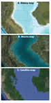
nonnumerical sense of scale. Maps included a “Blakey” map (Fig. 1A; see deeptimemaps.com and Blakey and Ranney,
2008, for additional examples), a “Morris” map (Fig. 1B; see Morris et al., 2016), and a Google Earth–style
“satellite” map, produced by stitching together U.S. Department of Agriculture (USDA) satellite data from the
Java Sea and the Andes Mountains to create a photorealistic rendition of an interior seaway bounded by mountains
(Fig. 1C; https://earth.google.com/web/ [created 2017; accessed August 2021]).
 Figure
1
Figure
1
Paleogeographic maps used in this study, including views of the western United States ~80 m.y. ago from (A)
deeptimemaps.com (see also Blakey and Ranney, 2008), (B) Morris et al. (2016), and (C) U.S. Department of
Agriculture satellite imagery, stitched together from Google Earth (2017). A legend is not included because such
images generally do not have one when employed in public venues, such as on reader rails, on interpretive
panels, or in animations.
Our study consisted of scripted interviews (Supplemental Material File S11) with a random selection
of adults, including college-age students (hereafter the “public”; n = 110; Table S1), who visited the
Denver Museum of Nature & Science (DMNS), Garden of the Gods Park (GG), and the Natural History Museum of
Utah (NHMU). Interviews were also conducted with a group of geoscientists who had graduate geology degrees and
used satellite imagery in their vocation (hereafter the “professionals”; n = 38). Each interviewee was
handed an 8″ × 10″ color print of one of the paleogeographic maps (Fig. 1), provided with a brief description of
what they were looking at, and verbally asked questions about it (see File S1 for list of questions and
interview script). All three maps were shown for the final interview question.
Interview recordings were transcribed and analyzed in an emergent coding process.
Common themes were built into a coding manual (File S2 [see footnote 1]) and, to ensure reproducibility, one of
us coded the entire dataset. Inter-rater reliability was assessed for each field by an additional researcher who
coded 16% of the dataset. Cohen’s kappa values were >0.60 for all codes and determined to have substantial to
near-perfect agreement. For chi-square tests, the public audience was sorted into two groups based on their
self-rated level of past experience viewing satellite imagery, including those who rated themselves 1–3 on a
scale of 1–5 (our “novice” group; n = 77) and those who self-rated as 4–5 (our “experienced” group;
n = 33); the geoscientist community remained in their own “professional” group for these analyses.
Results
Participants were asked to list landscape or water features they saw on the map. The public distinguished areas
of land and water well (95% of respondents; Table S2) and identified several specific features. Eighty-six
percent of respondents noted areas of high elevation (e.g., mountains), 68% identified the portrayed water body
as an ocean or sea, and 41% mentioned at least one type of shoreline feature, such as an inlet, bay, or beach.
However, this group often missed subtle terrain features commonly identified by professionals. For example, 66%
of professional geoscientists saw rivers, whereas only 27% of the public did.
Professionals were also more likely to identify features commonly listed by the public: 95% noted areas of high
elevation, 97% identified ocean or sea, and 79% mentioned at least one shoreline feature.
This offset in performance was consistent when examining the average number of features correctly identified.
The public correctly identified an average of 2.98 features, whereas the professionals identified 5.34 features
(Fig. 2A); a one-way ANOVA test showed this difference to be significant (F(1,146) = [72.12], p <0.001).
Likewise, experience viewing satellite imagery correlated with increased performance at identifying landscape
features. Novices (self-rating of 1–3 experience level on a scale of 1–5) identified an average of 2.74
features, whereas more experienced members of the public (self-rating of 4–5) averaged 3.55 features. Chi-square
testing confirmed correlation between number of features correctly identified and sorting into the novice
public, experienced public, or professional group (χ2 = 63.6, p <0.001; Fig. 2C). Interestingly,
older respondents (60+ years) correctly identified an average of 3.21 features, whereas younger respondents
(<60 years) averaged 2.93 features. Respondents who were shown the Morris map (Fig. 1B) identified an average
of 3.29 features, whereas respondents shown the other two maps averaged 2.82 features (Fig. 2A).
 Figure 2
Performance of public and professional communities at identifying (A) multiple landscape features and (B)
correct climate portrayed in three paleogeographic maps (Blakey, Morris, and satellite). (C, D) Relationship
between past experience with satellite images and success at (C) identifying landscape features and (D)
describing climate.
Communicating the Climate of Ancient Earth
Participants were asked to describe the climate shown on the map. Although multiple subclimates were portrayed,
the goal of the maps was to show the overall tropical conditions present during this time period. Only 41% of
the public mentioned “tropical” (or included some synonym for “wet” and “warm”) in their description. Likewise,
only 55% of professionals described the climate as tropical (Fig. 2B).
Participants experienced at viewing satellite images (self-rating of 4–5) identified a tropical climate 48% of
the time, whereas novices (self-rating of 1–3) identified a tropical climate only 38% of the time (Fig. 2D).
However, individual variability was too high to suggest a correlation with a chi-square test (χ2 =
3.5, p = 0.18). Both public and professional groups performed best at identifying climate when shown the
satellite map (Fig. 2B).
Questions about Paleogeographic Maps
Participants were asked if they had questions about their maps. Many respondents either had a question or
presented a hypothesis about how ancient Earth changed to modern Earth (39% public; 29% professionals; Table S3
[see footnote 1]). Nearly 64% of the public mentioned plate tectonics and one-third of respondents either asked
about or referenced the time period shown by the map (32% public; 32% professionals). Additionally, 26% of the
professionals’ responses indicated that they wanted to know what sources of data were used to construct maps
(vs. 6% of the public). Common secondary themes for both groups were requests to see more area than shown and
confusion about what volcanoes looked like.
Preference in Map Portrayal
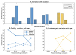
For the final interview question, participants were shown all three paleogeographic maps and asked to indicate
which version they preferred. The public favored the Morris map (53%) versus the Blakey (25%) or satellite map
(12%; Fig. 3A). Ten percent of respondents ranked two or more maps as equally preferred. This preference was
statistically significant (one way ANOVA; F(2,447) = [21.63], p <0.001) and most pronounced at the DMNS and
GG locations (Fig. 3A). Chi-square testing also showed correlation between age and favorite map (χ2 =
7.7, p = 0.05), with younger public participants choosing the Morris map and older (45+ years) participants
preferring the Blakey map (Fig. 3B). Professionals were split between the Blakey (39%) and Morris map (37%; Fig.
3A) and exhibited similar preferences by age (Fig. 3C).
 Figure
3
Figure
3
Variations in preferred paleogeographic map based on (A) interview location (Denver Museum of Nature &
Science [DMNS], Garden of the Gods Park [GG], and Natural History Museum of Utah [NHMU]) and age of the (B)
public and (C) professional (Prof) audiences.
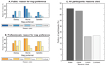
The public primarily chose the Morris map for its detail/realism (45% of respondents) and representation of
water (59%; Fig. 4). In contrast, the Blakey map was chosen for its detail/realism (33%) and high contrast
(33%). The satellite map was mostly chosen for its detail/realism (29%). These cited reasons were similar for
professionals. Professionals also cited the color palette used to define landscape features as important in
determining their map preference.
 Figure
4
Figure
4
Reasons for preferred paleogeographic map representation among (A) public and (B) professional audiences,
including the most commonly cited reasons among both communities (C).
Interpretations
The tested maps were successful at communicating basic terrain distinctions (e.g., areas of land vs. water) and
highlighting a few large-scale features (e.g., ocean/sea, shoreline, a high-elevation feature). This
interpretation is consistent with observed public audience success in interpreting satellite data (Svatoňová,
2016a). Consequently, the success of popular paleogeographic maps depends largely on the application goal. If
maps are used to help viewers distinguish between land and water boundaries and highlight visually large terrain
features, they are successful.
However, our results suggest that if maps are used to communicate smaller-scale terrain features (e.g., rivers,
volcanoes), visualize subtle features (e.g., flatland or plains), or distinguish between similar features (e.g.,
delta vs. beach vs. inlet), they will not succeed for the average adult, including college-age adults. These
results parallel observations of public ability to interpret modern aerial images (Lloyd et al., 2002).
More nuanced terrains are visible to the trained eye. Professionals identified more than five different terrain
features (Fig. 2A), a finding supported by research on modern landscapes that shows that practice and training
leads to greater proficiency at interpreting geospatial imagery (Svatoňová, 2016b; Šikl et al., 2019; Arthurs et
al., 2021). Likewise, we found a correlation between self-rated experience and number of features correctly
identified (Fig. 2C), suggesting that increased experience elevates performance of older public respondents
versus younger respondents. This result resonates with findings that show that increased discipline-specific
knowledge improves scientific observation (e.g., Barth-Cohen and Braden, 2021).
Intriguingly, the artistic style of the paleogeographic map may also influence performance. Public respondents
identified ~0.5 more features using the Morris map (the map they liked best) versus the satellite map. This
influence has been observed in studies on the interplay between aesthetics and viewer perception (Daniel and
Meitner, 2001) and on effective and inclusive visualization (Sheppard, 2001; Sheppard and Cizek, 2009; Oliveira
and Partidário, 2020). In contrast, professionals performed best on the satellite map—the map they liked least,
but also the presentation they were most familiar with, given their vocation.
Surprisingly, less than half of the public population identified the tropical climate portrayed by the maps
(Fig. 2B). Professionals did better, but not significantly so (55% of respondents). Although there is research
on how audiences perceive aerial and satellite landscape features (Lloyd et al., 2002; van Coillie et al., 2014;
Svatoňová, 2016a), no similar research has explored how audiences perceive climate. This gap may relate to the
challenge of deriving climate from true-color satellite imagery. In practice, other spectral bands and remote
sensing tools are used to provide data on precipitation and temperature (see reviews by Tomlinson et al., 2011;
Levizzani and Cattani, 2019).
In both study groups, most participants got at least one component of climate (i.e., warm or wet) correct.
However, both of these terms are subjective—a subtropical or temperate climate could also be described as warm
and wet. Further, because we accepted any description of climate including synonyms for warm and wet as correct,
it is possible the percentage of respondents who actually perceived a tropical climate was even lower than
reported. These results suggest that paleogeographic maps may have unforeseen challenges in communicating
climate. At best, such maps may exclude possible climate extremes (e.g., most participants did not perceive an
overall cold or dry climate), but viewers are expected to struggle with distinguishing where in a broad spectrum
of temperature and precipitation a portrayed region falls. These results are paralleled by research that
demonstrates the difficulty of communicating climate change through non-satellite visualizations (Lewandowsky
and Whitmarsh, 2018).
In considering our study’s impact on future paleogeographic map design, practices that place emphasis on subtle
landscape features of interest (e.g., a key or label pointing out volcanoes—in popular use, paleogeographic maps
generally lack legends) may improve performance at identifying terrain (Lloyd and Bunch, 2010). Adding more
visual context about temperature and precipitation may likewise improve performance at distinguishing climate.
One important climate cue is color choice. Similar to analysis of satellite imagery, map color creates a
greenness index that defines vegetation cover (Burgan and Hartford, 1993) and was frequently cited as an
indicator of climate (42% of public and 66% of professionals). Accordingly, the greenest map (satellite map) was
the map most likely to have its climate correctly identified as warm and wet (Fig. 2B). Landscape features may
also act as climate cues (e.g., snowy mountains, glaciers, dune fields). To narrow these indicators further, we
recommend adding explicit information on climate, such as a thermometer showing average annual temperature and a
gauge showing annual precipitation.
The most common public feedback includes a desire to understand how the portrayed Earth changed into modern-day
Earth (39% of respondents) and curiosity about the time period portrayed by the visualization (32%). These
responses suggest that paleogeographic maps should be paired with an explanation or visualization of how areas
change across time periods and a clear statement of the portrayed age. Furthermore, the public’s common
presentation of a hypothesis involving plate tectonics suggests the public was utilizing outside, but
interconnected, knowledge in their interpretations. Research exploring the application of interconnected
knowledge supports this linkage (e.g., Posner et al., 1982; Schlichting and Preston, 2015; van Kesteren et al.,
2018).
While professional geoscientists share some interests with the public, professionals are four times more likely
to question sources of data used to construct the map. This finding is supported by research that shows that
scientific experience enhances critical thinking about data legitimacy (Byrnes and Dunbar, 2014; Vincent-Lancrin
et al., 2019). If paleogeographic maps are being designed for a professional audience, including data sources
that underpin such maps should increase viewer satisfaction.
The public preferred the Morris map, primarily because of its representation of water and detail (Figs. 3 and
4). This map had the most visible bathymetry, which was likely especially important for a map portraying so much
water. In contrast, participants interviewed at NHMU and older respondents were less likely to choose the Morris
map (Fig. 4). These participants instead preferred the Blakey map, commonly citing its high contrast. We
hypothesize that this high contrast was more likely to be a deciding factor in settings with poor lighting (the
case at NHMU) and with older participants who are likely to have declined contrast sensitivity (see experiments
by Ashraf et al., 2021). These considerations may explain the relation between location, age, and map
preference.
Audience preferences inform insights for increasing the impact of paleogeographic maps among public and
professional audiences. For example, our findings suggest that most viewers prefer an illustrated rather than a
photo-accurate paleogeographic map and that the most effective map will have detailed bathymetry, as in the
Morris map, and high contrast, as in the Blakey map. The weight given to each of these components, and the
aesthetic style used to achieve them, should vary based on display location and the age of the target audience
(Oliveira and Partidário, 2020) and may be explored in future, specified work.
Conclusions
This study is the first to directly explore the efficacy of paleogeographic maps as communication tools. We
identified both successes and limitations in the efficacy of the three paleogeographic maps we tested. For
example, an average public viewer grasped the general terrain portrayed by a map, an indication that the impact
of large-scale tectonics was being absorbed, but was less likely to notice subtle features visible to an
experienced viewer or geoscience professional, like rivers, deltas, and plains. Surprisingly, both public and
professional audiences struggled to identify all components of portrayed climate. These findings suggest that
the effectiveness of popular paleogeographic maps varies largely depending on the audience (e.g., novice public
vs. experienced public vs. geoscience professional) and on what the map is trying to communicate (e.g., general
landscape vs. specific landscape vs. climate). Adding nontraditional content to paleogeographic maps, such as
landscape feature keys or more explicit indicators of climate, is predicted to improve their efficacy as
communication tools.
We also explored the impacts of paleogeographic maps. Many viewers, regardless of experience level, wanted more
information about the time period portrayed in the maps and were curious about how the ancient Earth displayed
in the maps reached modern-day conditions. Professionals also had questions about sources of data. We
hypothesize that tailoring paleogeographic maps to include this information will increase viewer engagement and
satisfaction. Likewise, participants had clear preferences for map aesthetics. All audiences tended to favor one
map over another due to representation of water and how “realistic” they felt it was. The result of the high
impact of oceanic depiction is striking, especially given that much of the earth-science community’s efforts
focus on continent reconstruction, and geoscientists tend to focus more on depictions of ancient land, rather
than ancient bathymetry.
In sum, these insights on paleogeographic map efficacy and recommended future practices begin to lay a
foundation for conveying ancient Earth in ways that meet the evolving needs of our audiences. We hope this pilot
work is the first of many studies to explore how we as a scientific community use paleogeographic maps to
communicate to the public, to students, and to each other.
Acknowledgments
We thank an anonymous Denver Museum of Nature & Science donor for supporting this scholarship, and the
members of the public, practicing geoscientists, and peers in our regional geoscience societies who contributed
to this work. We are grateful to Bob Raynolds, Brian Ruskin, and Patrick Sullivan for setting the stage for this
project; to Eric Smyth, Lynne Zummo, Brett Tennis, and Holger Petermann for helping with surveys and
interpretation; to Eric Small, Ben Livneh, and Mark Raleigh for guiding the project to completion; and to two
anonymous reviewers who helped improve this manuscript. Finally, we appreciate and are humbled by the
field-defining work of Ron Blakey, Chris Scotese, and contributors to the Rocky Mountain Association of
Geologists’ “Big Red Book” (Mallory, ed., 1972) for paving the way for our success.
References Cited
- Arthurs, L.A., Baumann, S.P., Rice, J.M., and Litton, S.D., 2021, The development of individuals’
map-reading skill: What research and theory tell us: International Journal of Cartography, v. 9, p. 3–28,
https://doi.org/10.1080/23729333.2021.1950318.
- Ashraf, M., Wuerger, S., Martinovic, J., and Mantiuk, R., 2021, Effect of age on threshold and
suprathreshold contrast vision: Journal of Vision, v. 21, https://doi.org/10.1167/jov.21.9.2574.
- Barth-Cohen, L.A., and Braden, S.K., 2021, Unpacking the complexity in learning to observe in field geology:
Cognition and Instruction, v. 40, p. 233–265, https://doi.org/10.1080/07370008.2021.1934683.
- Blakey, R., and Ranney, W., 2008, Ancient Landscapes of the Colorado Plateau: Grand Canyon, Arizona, Grand
Canyon Association, 156 p.
- Blank, L.M., Almquist, H., Estrada, J., and Crews, J., 2016, Factors affecting student success with a Google
Earth-based earth science curriculum: Journal of Science Education and Technology, v. 25, p. 77–90,
https://doi.org/10.1007/s10956-015-9578-0.
- Bohman, A., Neset, T.-S., Opach, T., and Rød, J.K., 2015, Decision support for adaptive action: Assessing
the potential of geographic visualization: Journal of Environmental Planning and Management, v. 58, p.
2193–2211, https://doi.org/10.1080/09640568.2014.973937.
- Burgan, R.E., and Hartford, R.A., 1993, Monitoring vegetation greenness with satellite data: General
Technical Report INT-297, U.S. Department of Agriculture, Forest Service, Ogden, Utah, 13 p.
- Byrnes, J.P., and Dunbar, K.N., 2014, The nature and development of critical-analytic thinking: Educational
Psychology Review, v. 26, p. 477–493, https://doi.org/10.1007/s10648-014-9284-0.
- Caquard, S., 2011, Cartography I: Mapping narrative cartography: Progress in Human Geography, v. 37, p.
135–144, https://doi.org/10.1177/0309132511423796.
- Daniel, T.C., and Meitner, M.M., 2001, Representational validity of landscape visualizations: The effects of
graphical realism on perceived scenic beauty of forest vistas: Journal of Environmental Psychology, v. 21, p.
61–72, https://doi.org/10.1006/jevp.2000.0182.
- Levizzani, V., and Cattani, E., 2019, Satellite remote sensing of precipitation and the terrestrial water
cycle in a changing climate: Remote Sensing, v. 11, https://doi.org/10.3390/rs11192301.
- Lewandowsky, S., and Whitmarsh, L., 2018, Climate communication for biologists: When a picture can tell a
thousand words: PLoS Biology, v. 16, https://doi.org/10.1371/journal.pbio.2006004.
- Lewis, J.L., and Sheppard, S.R.J., 2006, Culture and communication: Can landscape visualization improve
forest management consultation with indigenous communities?: Landscape and Urban Planning, v. 77, p. 291–313,
https://doi.org/10.1016/j.landurbplan.2005.04.004.
- Lloyd, R.E., and Bunch, R.L., 2010, Learning geographic information from a map and text: Learning
environment and individual differences: Cartographica: The International Journal for Geographic Information
and Geovisualization, v. 45, p. 169–184, https://doi.org/10.3138/carto.45.3.169.
- Lloyd, R., Hodgson, M.E., and Stokes, A., 2002, Visual categorization with aerial photographs: Annals of the
Association of American Geographers, v. 92, p. 241–266, https://doi.org/10.1111/1467-8306.00289.
- Morris, T.H., Spiel, K.G., Cook, P.S., and Bonner, H.M., 2016, Landscapes of Utah’s Geologic Past: A Summary
of Utah’s Fascinating Geologic History: Provo, Utah, BYU Press, 80 p.
- Oliveira, A.R., and Partidário, M., 2020, You see what I mean?—A review of visual tools for inclusive public
participation in EIA decision-making processes: Environmental Impact Assessment Review, v. 83,
https://doi.org/10.1016/j.eiar.2020.106413.
- Posner, G.J., Strike, K.A., Hewson, P.W., and Gertzog, W.A., 1982, Accommodation of a scientific conception:
Toward a theory of conceptual change: Science Education, v. 66, p. 211–227,
https://doi.org/10.1002/sce.3730660207.
- Schlichting, M.L., and Preston, A.R., 2015, Memory integration: Neural mechanisms and implications for
behavior: Current Opinion in Behavioral Sciences, v. 1, p. 1–8, https://doi.org/10.1016/j.cobeha.2014.07.005.
- Sheppard, S.R.J., 2001, Guidance for crystal ball gazers: Developing a code of ethics for landscape
visualization: Landscape and Urban Planning, v. 54, p. 183–199, https://doi.org/10.1016/S0169-2046(01)00135-9.
- Sheppard, S.R.J., and Cizek, P., 2009, The ethics of Google Earth: Crossing thresholds from spatial data to
landscape visualisation: Journal of Environmental Management, v. 90, p. 2102–2117,
https://doi.org/10.1016/j.jenvman.2007.09.012.
- Sheppard, S.R.J., Shaw, A., Flanders, D., and Burch, S., 2008, Can Visualisation Save the World? Lessons for
Landscape Architects from Visualizing Local Climate Change: Proceedings of Digital Design in Landscape
Architecture 9th International Conference on IT in Landscape Architecture, Dessau/Bernburg, Germany: Anhalt
University of Applied Sciences, May 29–31, 2008.
- Šikl, R., Svatoňová, H., Děchtěrenko, F., and Urbánek, T., 2019, Visual recognition memory for scenes in
aerial photographs: Exploring the role of expertise: Acta Psychologica, v. 197, p. 23–31,
https://doi.org/10.1016/j.actpsy.2019.04.019.
- Svatoňová, H., 2016a, New trends in obtaining geographical information: Interpretation of satellite data,
in Maturo, A., Hošková-Mayerová, Š., Soitu, D.-T., and Kacprzyk, J., eds., Recent Trends in Social
Systems: Quantitative Theories and Quantitative Models: Cham, Switzerland, Springer International Publishing,
p. 173–182, https://doi.org/10.1007/978-3-319-40585-8_15.
- Svatoňová, H., 2016b, Analysis of visual interpretation of satellite data: The International Archives of the
Photogrammetry, Remote Sensing and Spatial Information Sciences, v. XLI-B2, XXIII ISPRS Congress, 12–19 July
2016, Prague, Czech Republic, https://doi.org/10.5194/isprs-archives-XLI-B2-675-2016.
- Tomlinson, C.J., Chapman, L., Thornes, J.E., and Baker, C., 2011, Remote sensing land surface temperature
for meteorology and climatology: A review: Meteorological Applications, v. 18, p. 296–306,
https://doi.org/10.1002/met.287.
- van Coillie, F., Gardin, S., Anseel, F., Duyck, W., Verbeke, L., and De Wulf, R., 2014, Variability of
operator performance in remote-sensing image interpretation: The importance of human and external factors:
International Journal of Remote Sensing, v. 35, p. 754–778, https://doi.org/10.1080/01431161.2013.873152.
- van Kesteren, M.T.R., Krabbendam, L., and Meeter, M., 2018, Integrating educational knowledge: Reactivation
of prior knowledge during educational learning enhances memory integration: npj Science of Learning, v. 3,
https://doi.org/10.1038/s41539-018-0027-8.
- Vincent-Lancrin, S., González-Sancho, C., Bouckaert, M., de Luca, F., Fernández-Barrerra, M., Jacotin, G.,
Urgel, J., and Vidal, Q., 2019, Foster-ing Students’ Creativity and Critical Thinking: What It Means in
School, Educational Research and Innovation: Paris, France, OECD Publishing, 350 p.,
https://doi.org/10.1787/62212c37-en.
- Wang, Q., Lekamalage, L., Chandrasena, T.N., and Lei, Y., 2019, A critical review of the application of
paleo-art in paleontological exhibition: A case study of the Dinosaurs of China exhibition in Wollaton Hall
and Lakeside Arts, Nottingham: Museum Management and Curatorship, v. 34, p. 521–536,
https://doi.org/10.1080/09647775.2019.1573700.
- Witton, M.P., 2017, Recreating an Age of Reptiles: Ramsbury, UK, The Crowood Press, 112 p.
- Xiang, X., and Liu, Y., 2016, Understanding ‘change’ through spatial thinking using Google Earth in
secondary geography: Journal of Computer Assisted Learning, v. 33, p. 65–78,
https://doi.org/10.1111/jcal.12166.